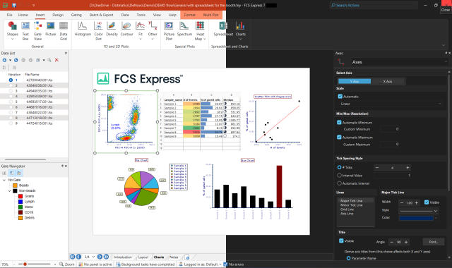
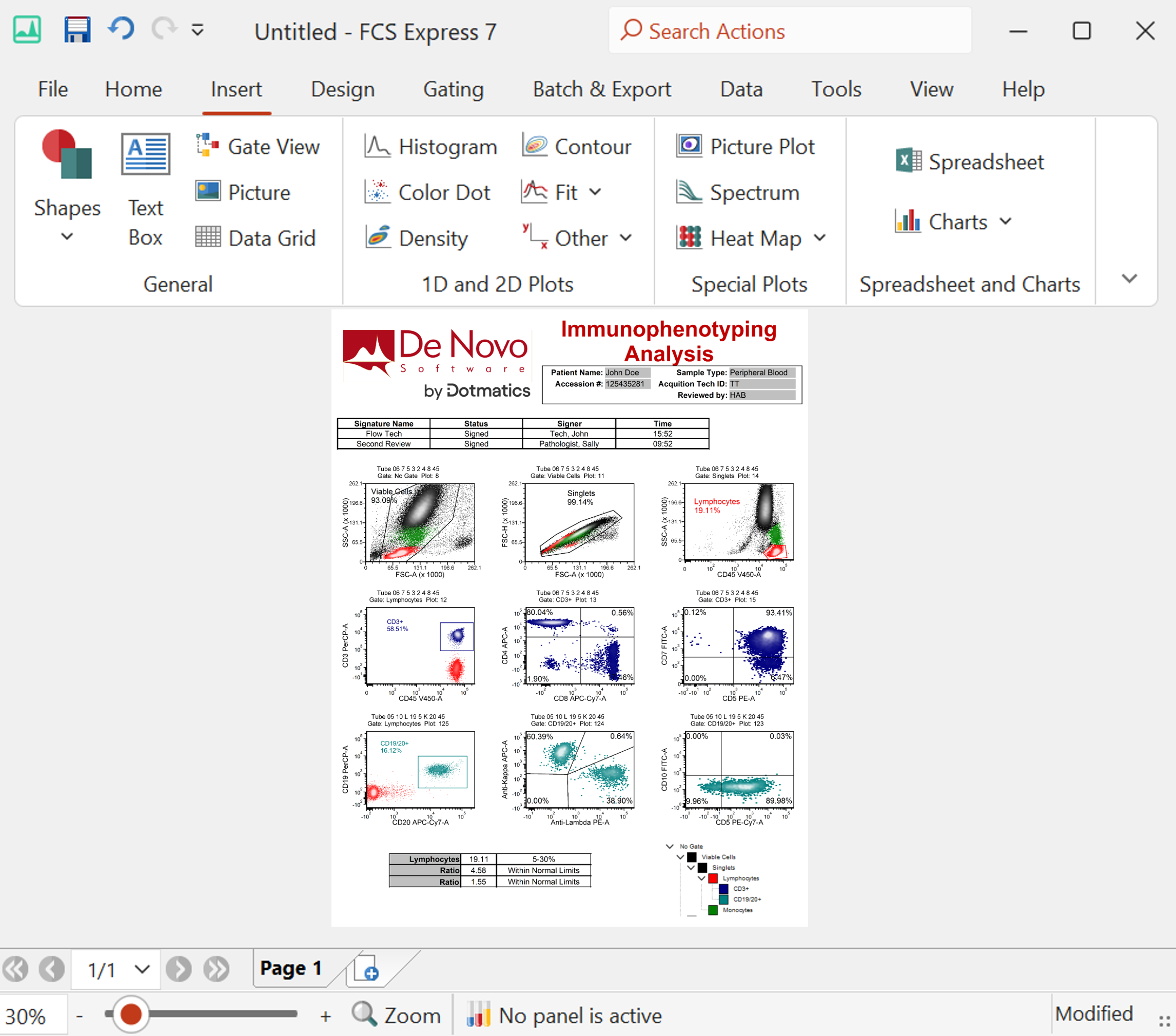
Quick Links
Show all your raw data
Data grids show all the raw data in your data set. You can select which parameters you wish to show. You can display numeric data, images and even the well location (if you have our high content add-on). Alternatively, by showing only the image parameters, you can easily create image galleries.
Data Grids can show Back gating information
In the layout below a Data Grid was inserted for "Sample #1". Note the display of raw parameter data for all of the relevant channels. Gates that were assigned to "Sample #1" on the 2D plot (upper left) are displayed in the Data Grid as colored rectangular boxes.
Create Range Gates on Data Grids
Range gates allow you to select specific objects in your data set to include in a gate. You can then select specific images in your data set and see where they appear on dot plots and other visualizations.
![]() |
![]() |
| Creating a Range Gate on a data grid | A dot plot with the Range Gate applied |
Show only the images of cells within your gate
You can apply a gate to the data grid , so the data grid only shows the objects within the gate. This allows you to create a gate on any visualization (i.e. a dot plot in the example below) and only see the images of the cells in that gate.
![]() |
![]() |
| The data grid on the right is showing on the cells in the "Responding Cells" gate, which was defined in the dot plot on the left. | |
Edit Custom Data in Data Grids
Data Grids also allow any token or token formula to be added to a custom data set. In the layout below a Data Grid was created to display a custom data set of "% Live" and "% Apoptotic" cells. The "% Gated" data was added to the grid by dragging or adding tokens to the grid and in the last "Token" column, a formula is being created to add a constant value to a token. The values from the Data Grid are being displayed in the Bar Plot above, note that some columns are "highlighted" in black to display the "true" or "false" value defined by a formula in the Data Grid.


